Designing the New RuneQuest - Part 22
Posted by Michael O'Brien on 21st Mar 2018
A TALE OF TWO THREE LOGOS
By Jason Durall, RuneQuest line editor
One of the more significant visual design elements to make for a new game has its choice of a logo. In some cases, such as for licensed games, these decisions are out of the hands of the designers and artists making the game. For example, Call of Cthulhu 7th Edition uses the classic logo, a logo that has been mostly unchanged for almost 40 years:
![]()
A logo speaks volumes about the game. It should evoke the tone and nature of the setting, it should be highly legible, it should be recognizable at a distance, and it should be visually appealing and adaptable enough that it can appear on a wide range of products and configurations. There are many other lesser considerations, such as whether it prints well in black-and-white, whether its dimensions are suitable for cover and spine usage, making sure it inadvertently doesn’t look too much like other logos, and so on.
When it came time to begin the visual design for the logo for Chaosium’s new edition of RuneQuest: Roleplaying in Glorantha, we took all of these into consideration, as well as many, many other concerns and preferences, all described below.
Some History – A Logorrhea of Logos
One of the more interesting challenges when designing a new logo for RuneQuest is that there’s no clear picture or consensus amongst fans what the default RQ logo is. A wide variety of logos have graced the cover of games in the 40-year-period since RQ was first published.
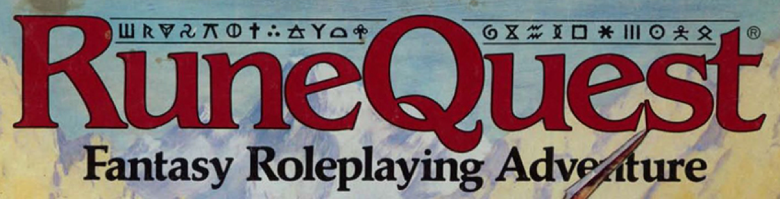
The 1st edition of RuneQuest a red version of the classic hand-drawn logo on the box, while the side of the box had another logo. The hand-drawn logo, interestingly, did not have the Q capitalized, as it was in the game’s text:

The 2nd edition added more color to the logo, but it was otherwise unchanged. A second printing of the box had yet another version of the logo on the edge of the box:

Taking the dust jacket off the rare red-leather 2nd edition hardcover revealed yet another logo:

The UK printing of the 2nd edition had a logo that was red and all-caps with a black outline:

RuneQuest 3rd edition, however, threw out all prior logo treatments and incorporated a rune-filled bar above the title:
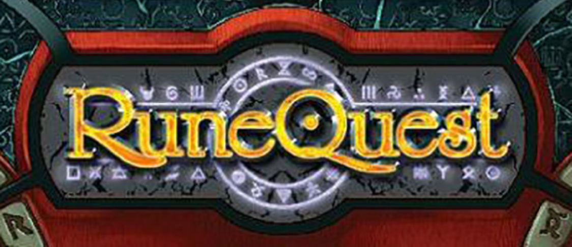
The 1st edition of Mongoose’s stewardship of the game had a bright gold logo sandwiched between and overlaying a circle of glowing runes on a stone slab, with sweeping tails on the R and Q. It bore some similarities to the RQ3 logo. Variant treatments of that logo removed the slab and turned the runes red.
Mongoose’s second edition had an entirely new logo, metallic gold with an italicized uncial font. It also featured sweepy R and Q tails:
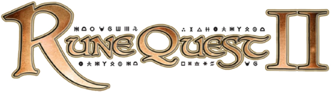
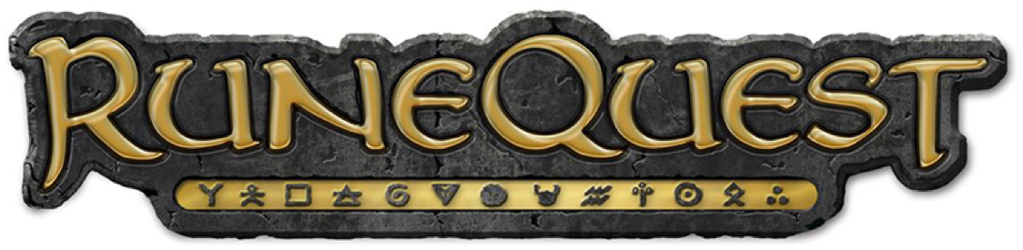
The Design Mechanism’s logo evoked a few prior logos, with the boxlike frame of the 1st and 2nd edition logo, the rune bar of the third, and restoring the Movement rune to its place in the middle of the Q.
A Logo for the new Chaosium Edition
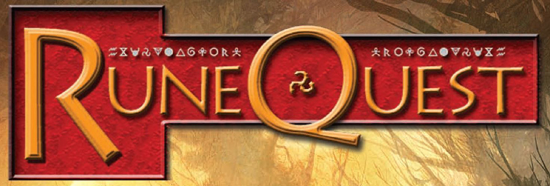
Here's a logo that was commissioned quite early but was decided against for a variety of reasons. It reminded us too much of the Mongoose logo, the runes were fighting the top and bottom scrollwork, and the different elements didn’t really gel. Our artist provided it mocked up against the RQ6 cover:
The RuneQuest Quickstart Adventure published in mid-2017 had its own logo, only intended for that product:
![]()
Ultimately, the decision about what to take influence from was as clear as a Darkwall spell. And of course, RuneQuest fans had very specific views about what the logo should look like and were not shy about letting us know.
Take One – The Gold in the Mold
Our first attempt at our new logo had a lengthy list of initial preferences, dos and don’ts, to the point where an art board was created to provide to the logo designer, so he’d have them all in one place. The board is embarrassingly crude, and isn’t meant for public display, but on it included some of the following requirements:
- Strong recognizable shape.
- Colors should be red and/or gold.
- Needs to look good in black & white and color.
- Needs a rune bar or some integration of runes.
- Must use the uncial font.
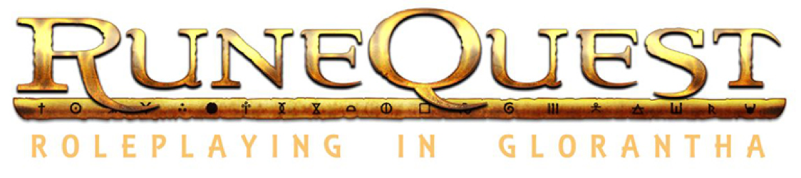
There were other considerations, but these were enough to start with. After a lot of tweaking the shapes of the letters, we decided that the stone mold design would help unify the logo’s design overall. The concept was “Out of an old mold, something bright and new emerges.”
Over the course of the logo’s design, the rune bar went from being two lines framing a line of runes (too faint) to a lozenge-shaped cartouche. We had the runes in bright red, but they looked like blood.
The end result was something we were not particularly enthusiastic about, but the artist was as frustrated as we were. It was the best we were going to be able to achieve, given the requirements, so we decided it was done.
This is what we revealed to our fans:
We revealed it on social media and the response was mixed, but generally unfavorable. Feedback (and there was a lot!) was that it felt bland, too old-school, that it evoked Middle-earth more than Glorantha, and that the stone background also brought to mind the Mongoose version of the game. All good points, and difficult to argue with.
Rather than engage and try to reshape it into something new immediately, we put the issue to rest and decided we’d revisit it later, as we had plenty of work to attend to.
Take two – the LOGO IN THE DUNES
A month or so later, it was time to think about the logo again. The stakeholders were divided on the first attempt, which was enough to realize it wasn’t working. So we reached out to another artist with considerable experience in logo design in the roleplaying game space, and let him know what we were looking for. We revised our list of requirements, struck the requirement for an uncial font, and we absolutely decided to avoid placing the runes against a stony background.
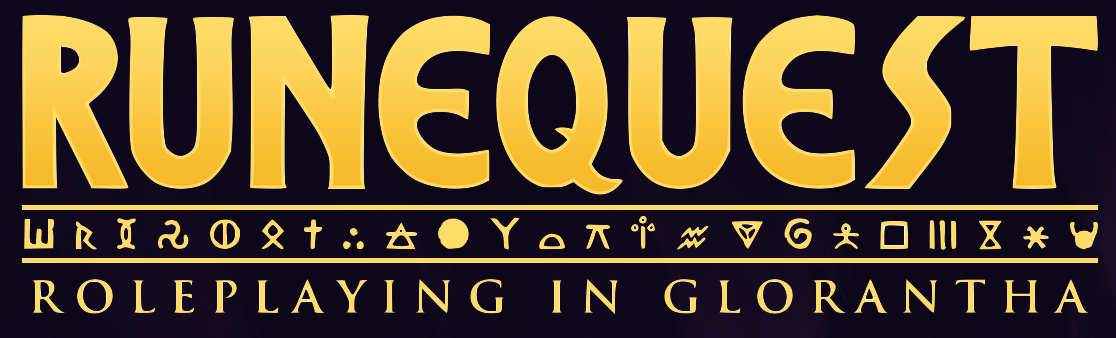
Looking at a few different fonts and treatments, we went with an intriguing one called Percolator that evoked the ancient world quite nicely but had an unfortunate association that would be hard to shake. With these in mind, the artist set forth and gave us a completely new take on a RuneQuest logo, but one which we’d eventually have to abandon for a few reasons.
While nice, it had some limitations, in that it was very faint and thin, not that easy to read at a distance, and the font had also been used as the title logo for the Syfy Network’s Dune and Children of Dune miniseries. DuneQuest? While the logo was quite nice on its own, it didn’t grab any of the stakeholders. There was no reason to exhibit it publicly, because deep down, though we recognized the quality of the work, it just didn’t feel like RuneQuest.
So, it was time to take another crack at it.
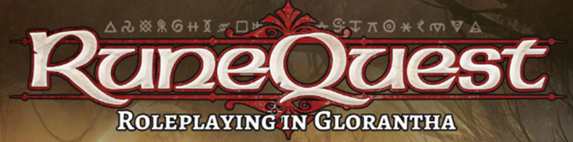
Take Three – Back to Basics
So we decided that it was time to look at past logos that we liked, such as the one for Call of Cthulhu, and decide to just throw out all of the requirements we’d had before. We wanted something that had an old world feeling but was relatively clean and not artificially weathered or aged. We decided against any gold, bronze, or metallic treatment, and we decided we’d go with a pale yet rich yellow. The only requirement for this version was that we absolutely wanted runes in the logo.
We drove our new artist a little bit crazy with back and forth about every tiny element of the logo, but ultimately it was a straightforward experience, with a clean initial look and feel, a solid execution with the initial attempt, and finally some minor tweaking about little aesthetic issues like how gradual the serif flares should be.
We shared it around the stakeholders and conducted some informal polling with some select family members and people whose design and aesthetic sense we trusted. We put it into a mockup of the new cover (more on that with the next Design Note) and were quite happy with the result.
As we’re in the process of laying out the book, our layout artist may tweak it a tiny bit to bring it in line with the interior design, but this is mostly done.
But, without further ado, here’s the new logo for RuneQuest: Roleplaying in Glorantha.
Let us know what you think!
Next Up: A progress update from Jeff and some sneak previews of what to expect from the new RuneQuest rulebook.