Out of the Suitcase #23: Facing the facts of a chaotic past...
Posted by Michael O'Brien on 14th Oct 2021
Chaosium President Rick Meints shares stories from a life-time as a collector of all things Chaosium.
Just the other day we had a fan ask about the Chaosium "Dragon" logo and why it didn't always have the dragon facing to the left on our products. While a short answer was given, there's a bit more to the story worth telling. It goes back to before The Chaosium was even a company. Let us drift back to the early 1970s...
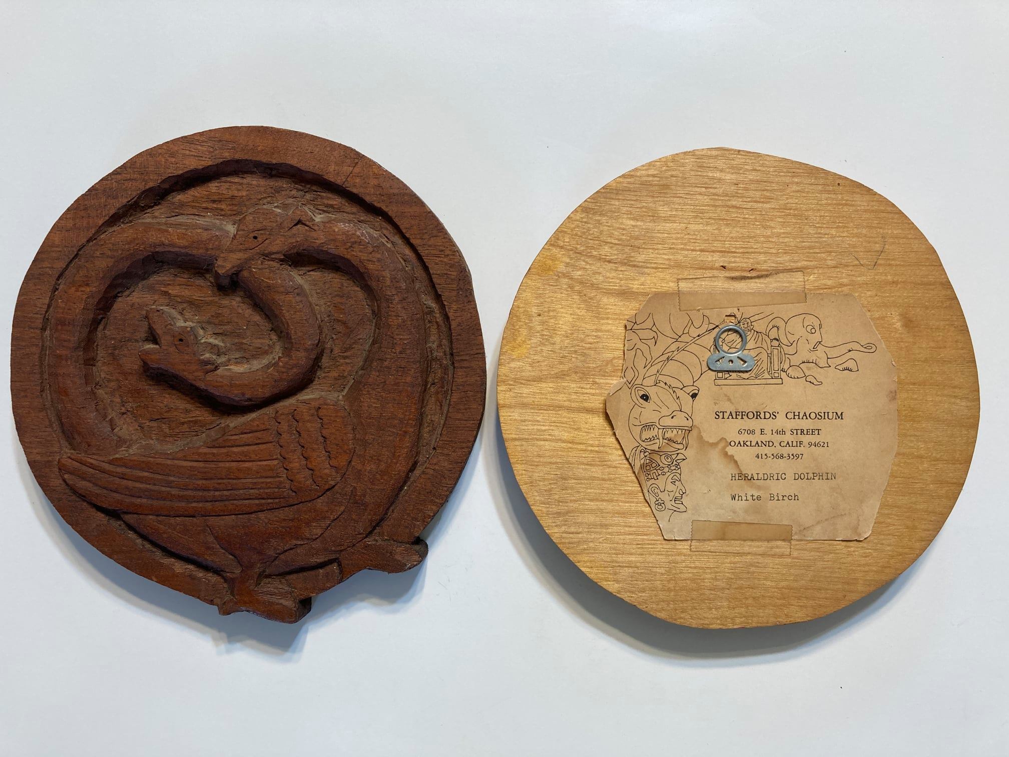
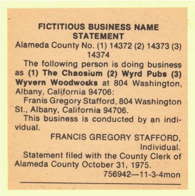
In 1974 Greg and his wife Cam started referring to their nascent business (soon to publish White Bear & Red Moon) as "Stafford's Chaosium". They lived in a tiny apartment which they shared with another family. This "house of chaos" as they called it was near the Oakland Coliseum, so they combined the words chaosium and coliseum to create the word "Chaosium". The business actually spanned more than just that game, as it also covered Greg's bespoke woodcarving efforts. The woodcarvings, done in a variety of rarer hardwoods, were the first "Chaosium" products to be labelled as such.
Greg commissioned some artwork for the first two versions of Chaosium stationary in 1975 as well. Steve Oliff seemed to like winged creatures, skeletons and arrows a lot. Yes, these were created with the traditional cut and paste method, including the use of White-out.
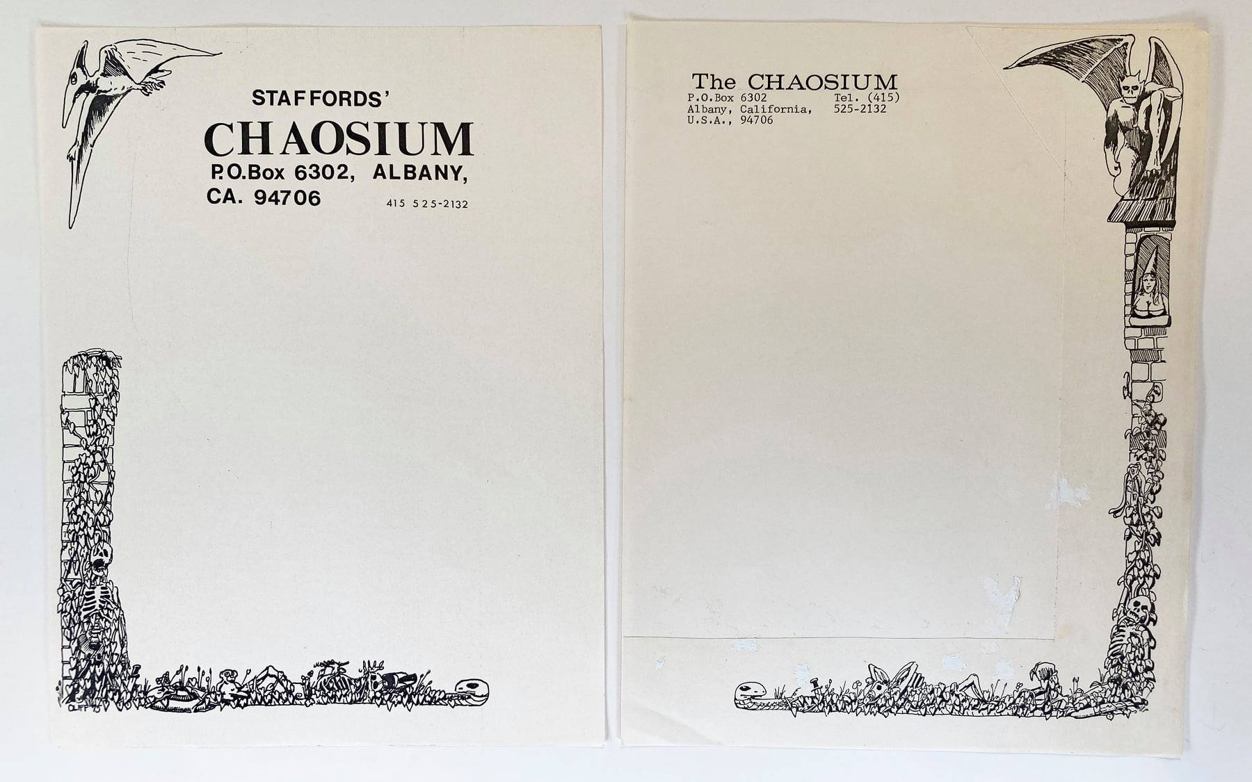
It wasn't until late October of 1975, after WB&RM had just been published, that Greg filed The Chaosium as DBA (Doing Business As) with the State of California.
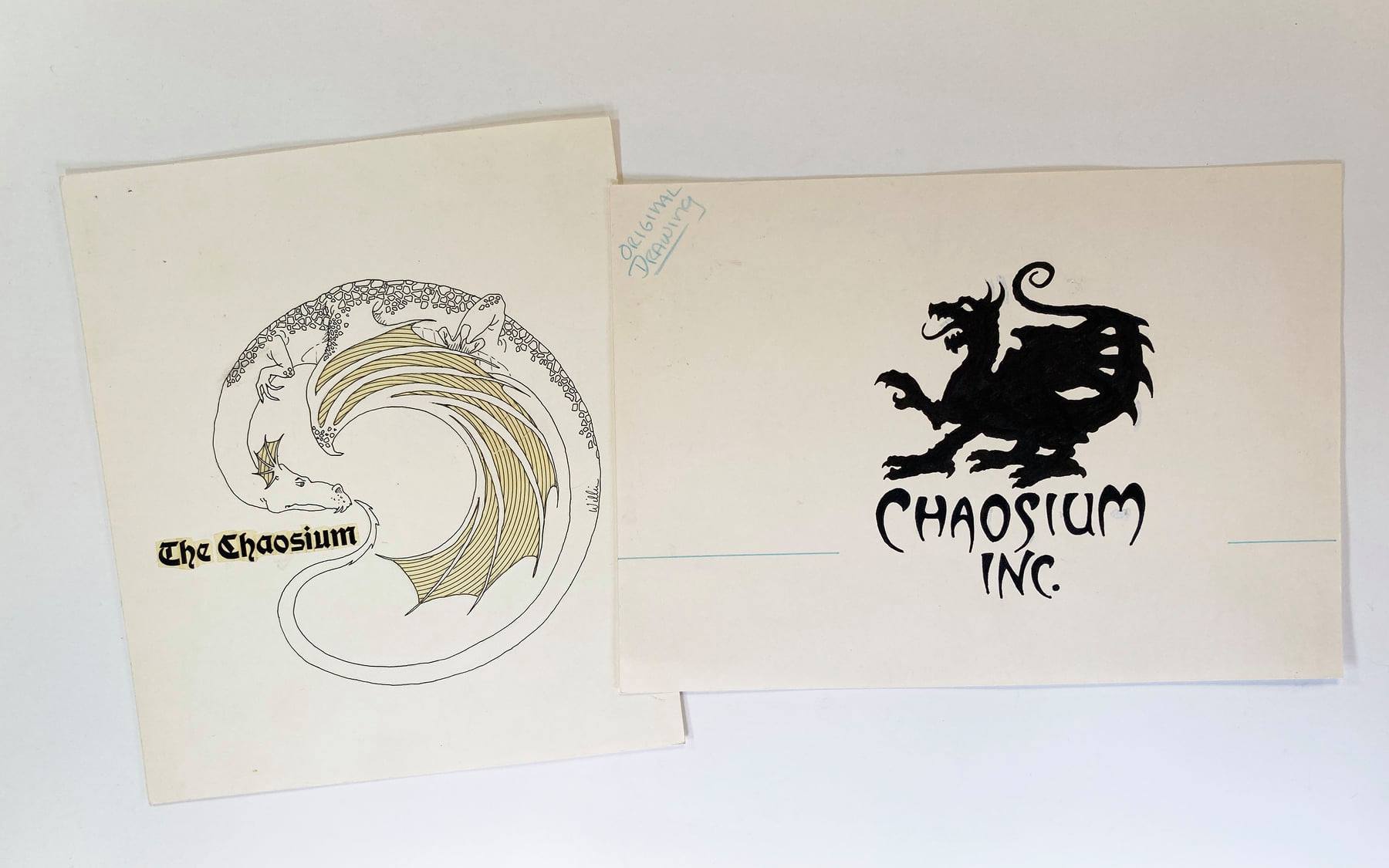
As additional products were developed the desire and need for a company logo grew. In 1978, the company settled on using a "dragon eating its tail". In 1980, when the company was finally incorporated in California, Chaosium commissioned the Dragon logo we commonly use to this day. It graces pretty much every product we have produced over the last 40 years.
The original ink drawing of the iconic current logo we still use is shown at the top of the page at the right. We believe it was drawn by Gene Day. The logo on the left (by William Church) was an experimental earlier version that only appeared in Wyrms Footnotes.
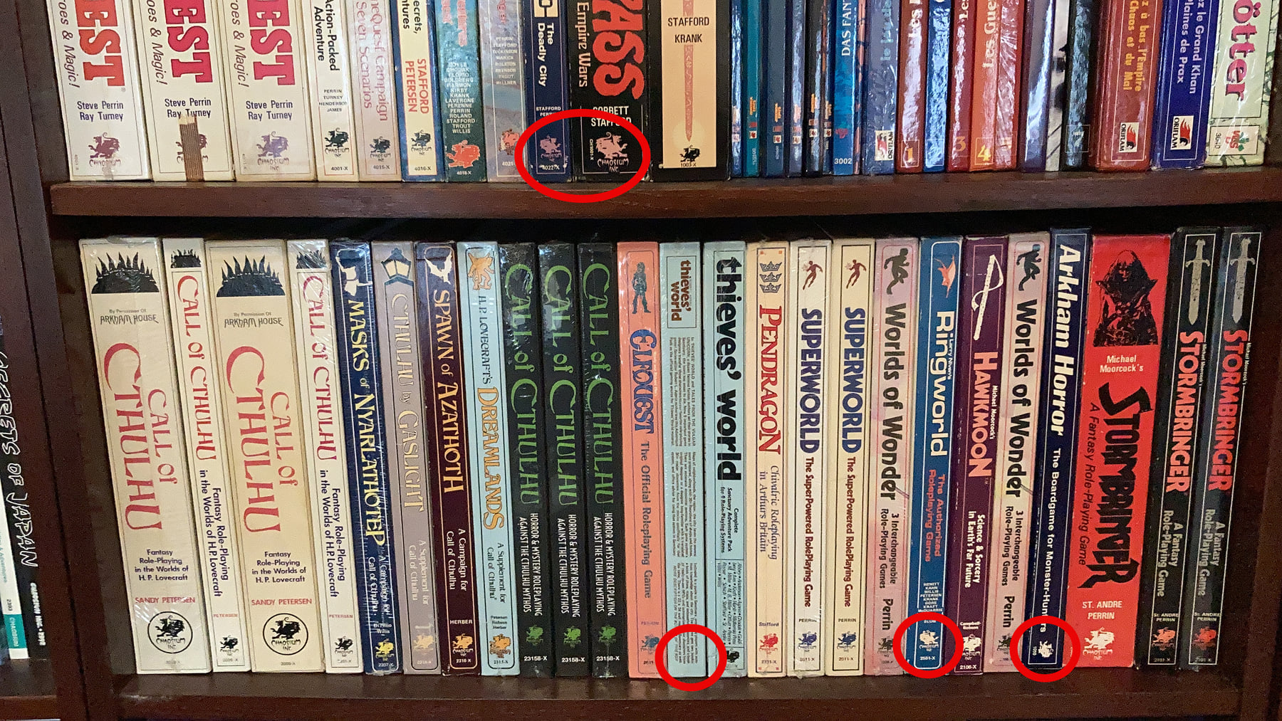
To circle back to the original question about why the dragon sometimes faces right instead of the more traditional left facing usage, the sad part of the story is that there is no real reason. As we like to jokingly say, we are The Chaosium, not The Orderium.
The Chaosium has always experimented with how we do things, including changes to our graphic design, packaging, and branding. Thus, on such products as Big Rubble, Dragon Pass, and Ringworld we find rare instances of the Dragon logo facing right. On one printing of Thieves' World the logo isn't on the left side of the box at all, and on Arkham Horror it faces upwards. This is strictly from the perspective of the box cover facing to the right, which is how I store all the boxed sets on my shelves. We have to bring some order out of Chaos, after all...